Formation
Researched and developed with a strong emphasis on modern Scandinavian design, the new Arctis headset brings refinement to a market largely devoid of it. The current landscape of gaming brands all follow a similar archetype, blending into a jumble of black and metallic noise. This undertaking aesthetically and functionally creates a holistic brand identity from on-shelf to online more befitting of the product's modern Scandinavian roots and separating itself from the competition.
Selected Points of Emphasis
• Color palette of dark gray/black with a bright accent is a category cliché that gets lost amongst the competition.
• Typography weight, case, tracking, leading are all inconsistent.
• Random off-brand color shifts serving no defined purpose.
• Overly granular yet unclear presentation gets few new consumers to scroll through.
• Consumers already familiar with product must scroll to bottom to purchase, yet also scroll up to view SKU-specific info.
Here we explore possible artistic directions for the then yet-to-be-named product. Experimenting with how expressive the brand identity can be through varying design directions, this is the first step of creating a disruptive, characterful identity.
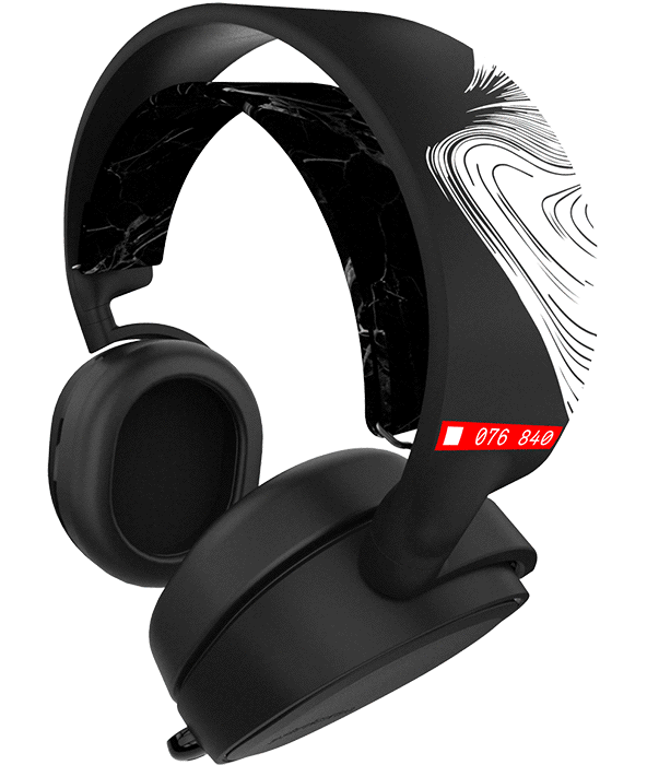
Due to engineering and logistical timelines, product and packaging visuals are the first priority in production. After initial research and auditing of the competitive market, these product and on-shelf visuals are created with the intent of exploring a wide range of artistic directions. Spanning aesthetic themes from synthetic futurism to Danish irreverence, here we delve into ways Arctis can be coherently disruptive.
Implementation
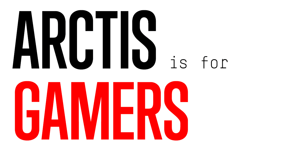
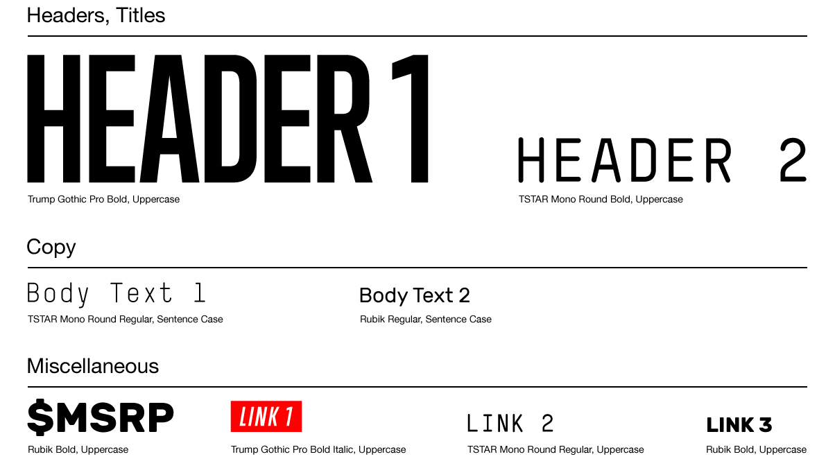
Inspired by the previous explorations, the Arctis visual identity features a highly defined graphic architecture combined with expressive, illustrated elements, to create a disruptive, potentially iconic on-shelf brand identity that can be easily expanded to other product lines and media types. Typography and graphics are designed with the sentiment of being equally practical in digital, print and motion.
In conjunction with the newly streamlined on-shelf identity, here we elevate the brand's online identity. The relatively homogenous Arctis product line allows for a universal product line overview page, whilst also allowing for a new e-commerce section dedicated for purchases and SKU-specific technical details. This new information architecture encourages greater creative expression on future launches, as well as a simpler, more designer and developer-friendly content creation and editing framework.
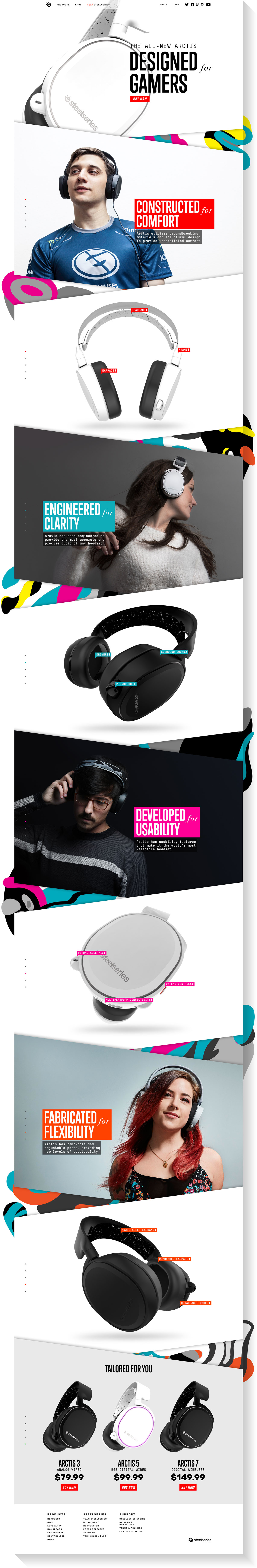
With a wealth of new features being universal to all Arctis models, a new overarching product line page allows for a more visually expressive and extensive product introduction that displays prominent features in a more structured and interactive narrative.
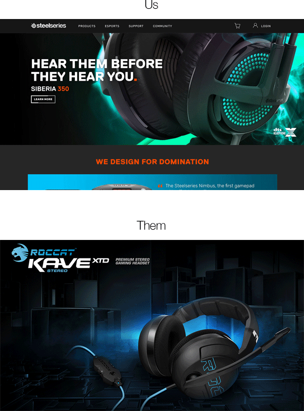
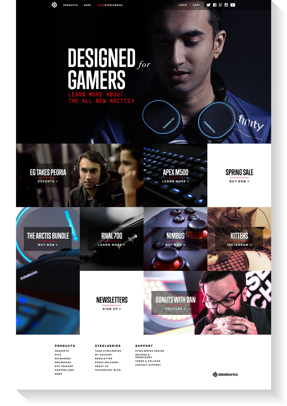
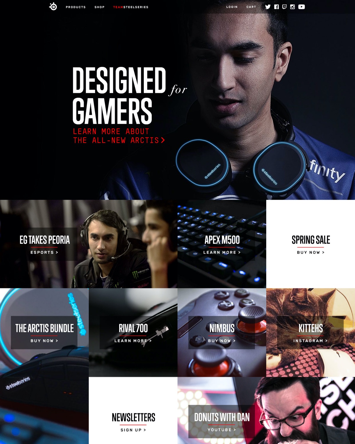
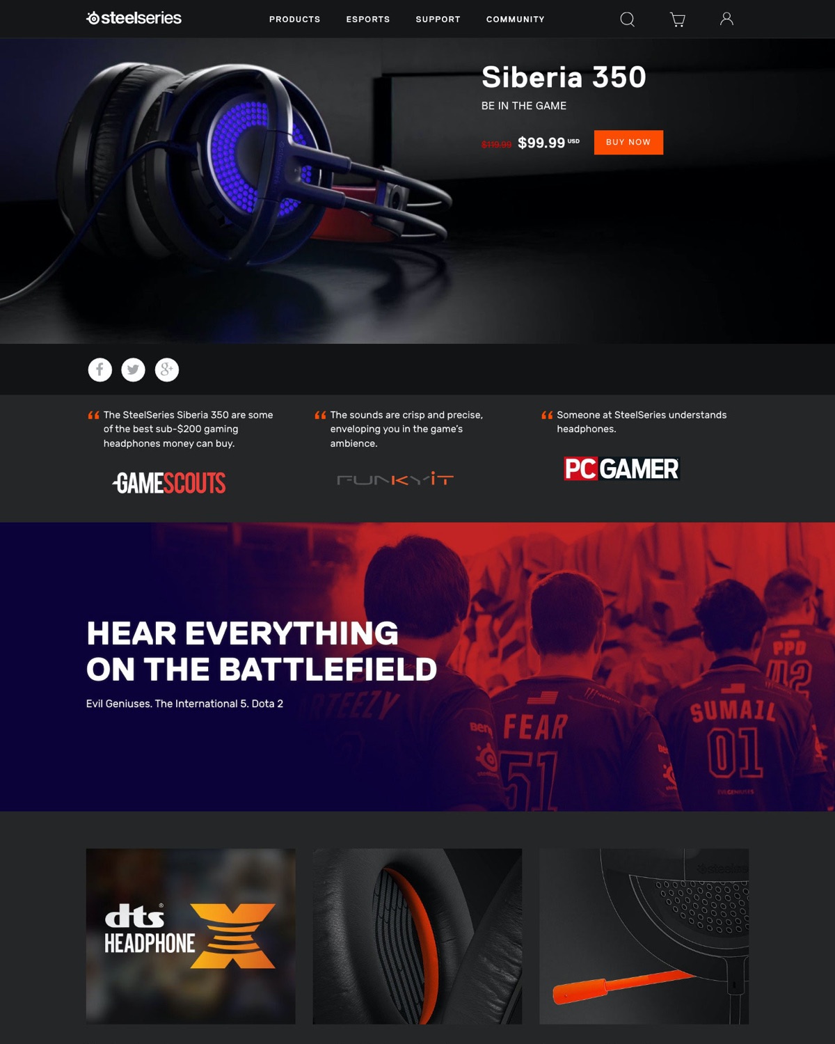
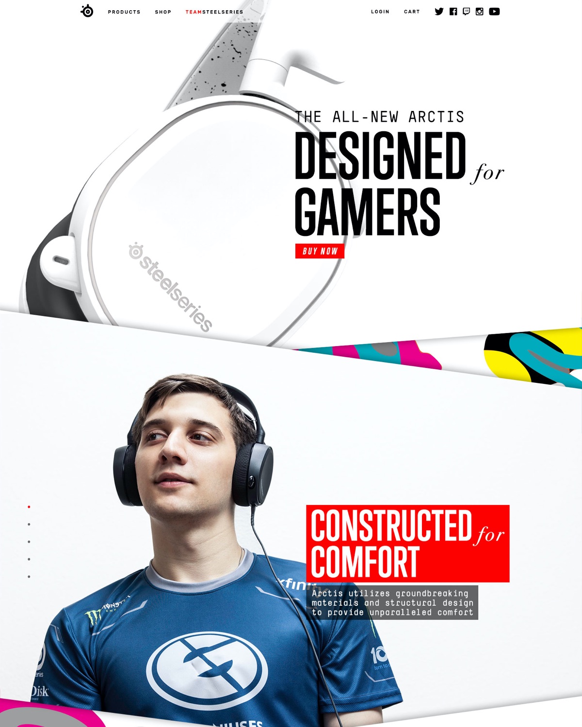
The new corporate landing page introduces itself with a header featuring imagery of actual human beings, something practically unheard of in this market. With new brief, straight-to-the-point copywriting, more personable, in situ product photography, and a more mobile-friendly grid layout that doesn't assume every user is viewing the site with a GTX 1080, the new online brand expression is a more inclusive, less hyperaggressive introduction from a brand looking for a wider range of consumers.
corporate landing page before/after
The new product section immediately separates itself from the competition through color and photography. With large, user-focused imagery, large swaths of white space, and accents of illustrated graphic elements, the visual energy and expressiveness of the page provides users a more affable, approachable interface that doesn't seem like something dictated by a product sales manager.
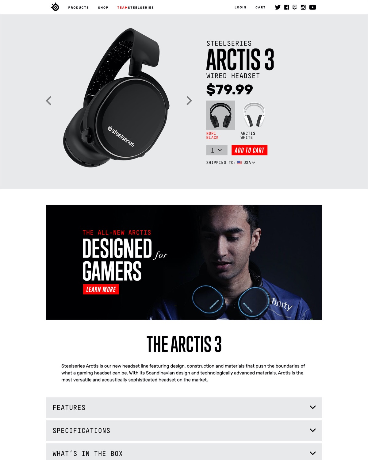
product line page before/after
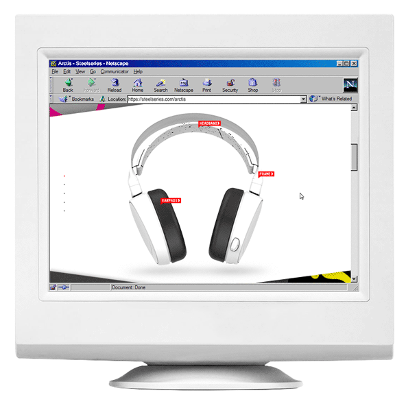
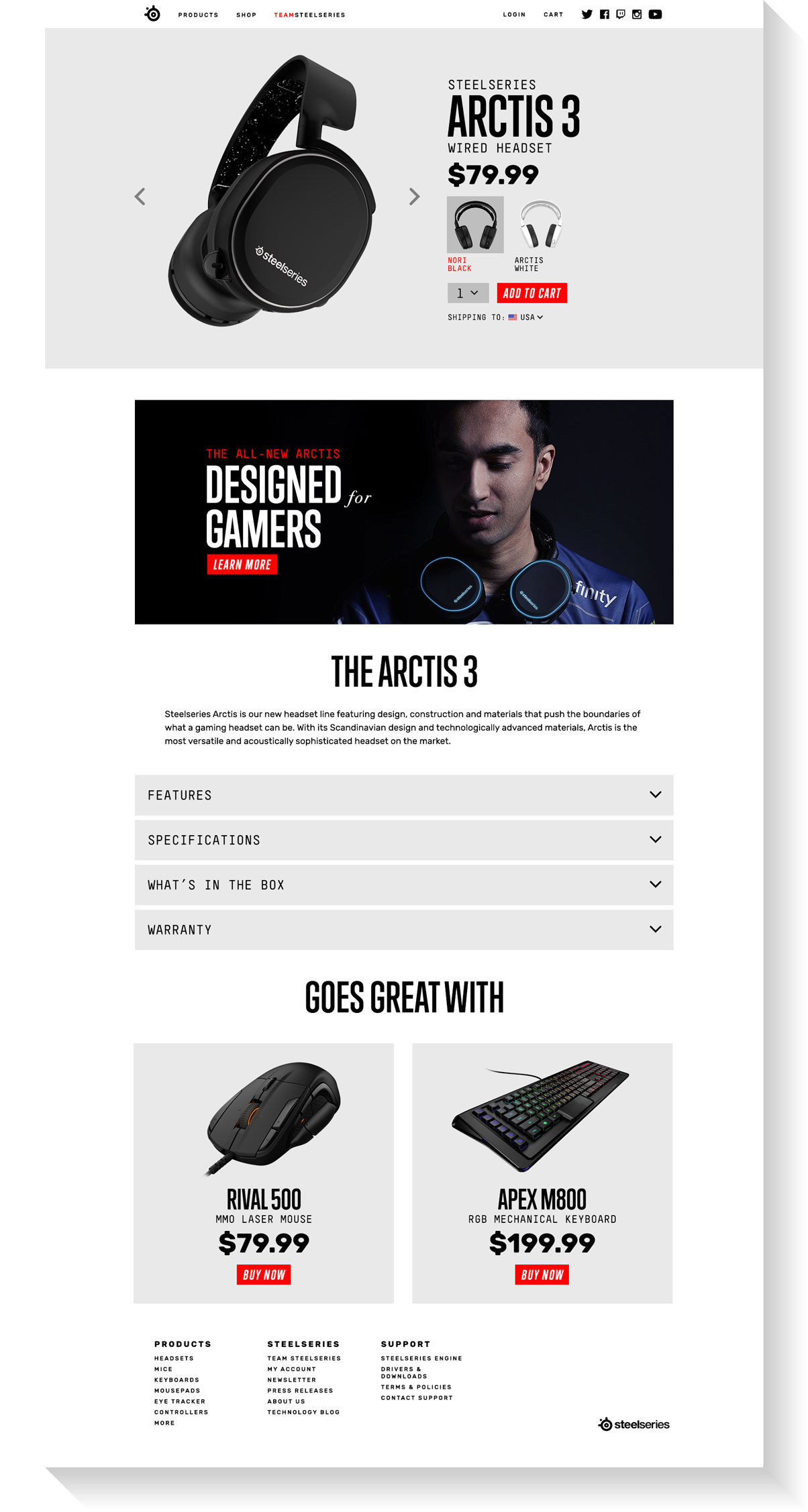
The new shop section of the website allows for a more informative and straightforward final point-of-purchase experience for visitors ready to buy. For visitors coming directly from a mid/bottom-funnel stage of product consideration, they will no longer have to scroll all the way to the bottom of a long product page and scroll back up for more detailed product information.
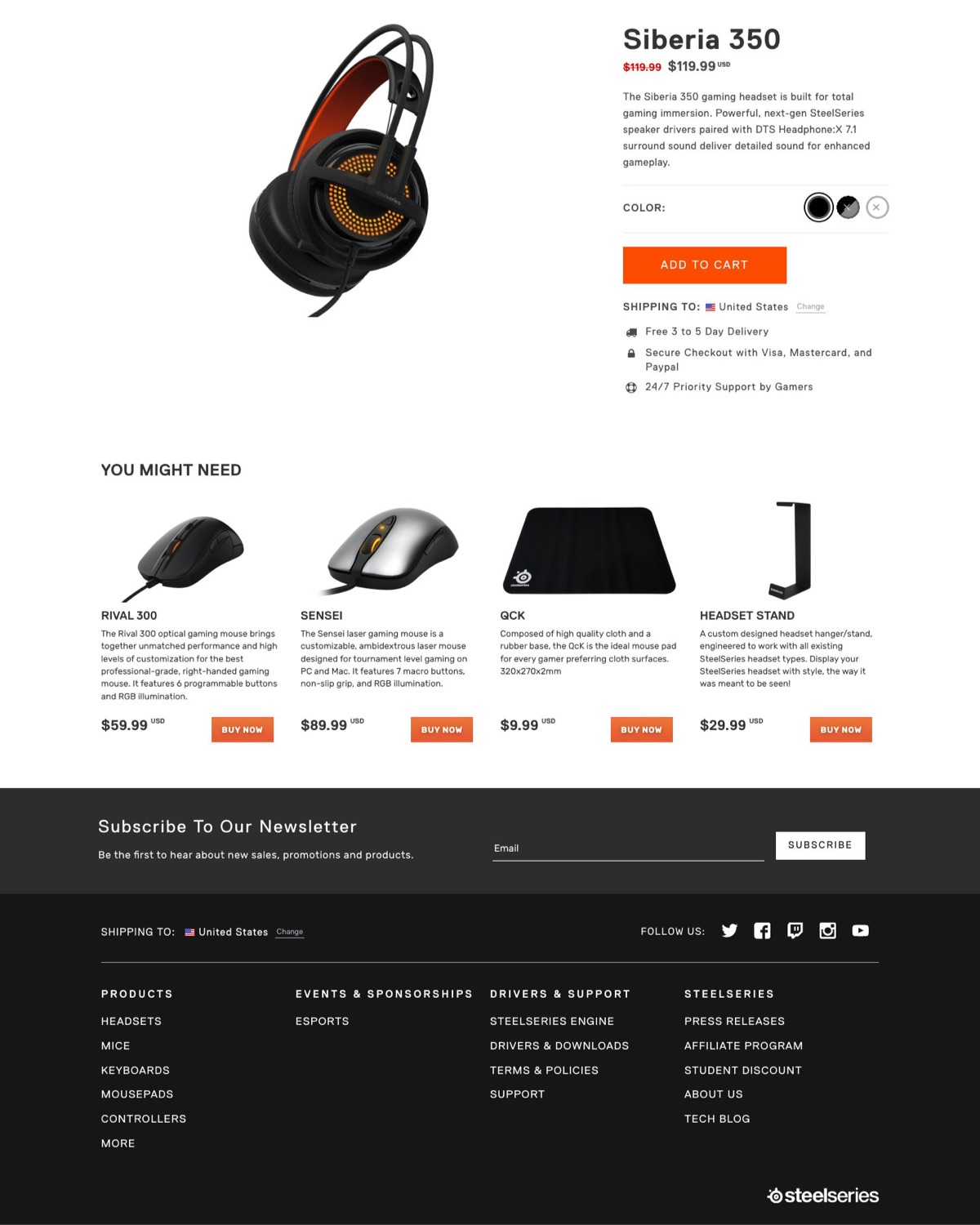
product SKU purchase page before/after