Belief
Facebook Inc. is undergoing a holistic corporate rebrand. By visually interpreting the empathetic ethos behind the new identity, we can create a more personable digital design system which accurately represents the new brand.
Proof
Artifacts: Corporate website landing, news, and content pages, Figma-based digital design system
Guidance: Art direction, content design, digital brand expression, UI, UX
Facebook, not Facebook
What was once just one singular app has now turned into a corporate colossus of many brands. This has created a messaging dichotomy between Facebook, the social media technology, and Facebook, the global holding company. To separate these two divergent entities sharing one umbrella, the Facebook (now known as Meta) company is rebranding with a direction based on a new, overarching company-wide ethos focused on empathy for their users.
To align with this new brand identity and art direction, this new Facebook brand requires a comprehensive re-design of its online presence.
What We're Working With
Exploration
While the new brand identity is being formed, we are concurrently designing the new online platform for this new brand. With only preliminary mock assets such as light video and print, and a team desiring to see a 1:1 expression of the preliminary brand identity as a digital interface, this is largely a stress test of predetermined art direction and graphic design of non-digital platforms leading our exploration, and how we can create a user-friendly experience with those elements.
As we expand the identity onto various digital surfaces, we start finding design and taxonomical issues to refine and evolve on. Here we discover issues such as the typography/photography relationship being challenging to work with, copy and taxonomies combining with the typography to give a tone of voice that seems at odds with the user-friendly ethos we are trying to emphasize, and the general dichotomy between Facebook, the company, and Facebook, the product.
Refinement
After some rounds of inital creative exploration, we've largely landed on our core UX/UI design. Realizing some of the digital issues brought about by the original brand identity design work, here we refine the relationship between typography and photography, and interface taxonomy and copy. This phase will lead into the systemization we will utilize for our eventual launch MVP.
Visually, the digital expression is starting to feel more in line with the ethos behind the new brand. Graphic design elements have been simplified for readability, and the harshness of the initial typography treatments is lessened by integrating the color and layout more cohesively with photography. Hero copy and interface taxonomies have been massaged to feature more personal, friendly language. We've also simplified our interface modules further, aiding in speeding up user intake and easing production design issues.
Systemization
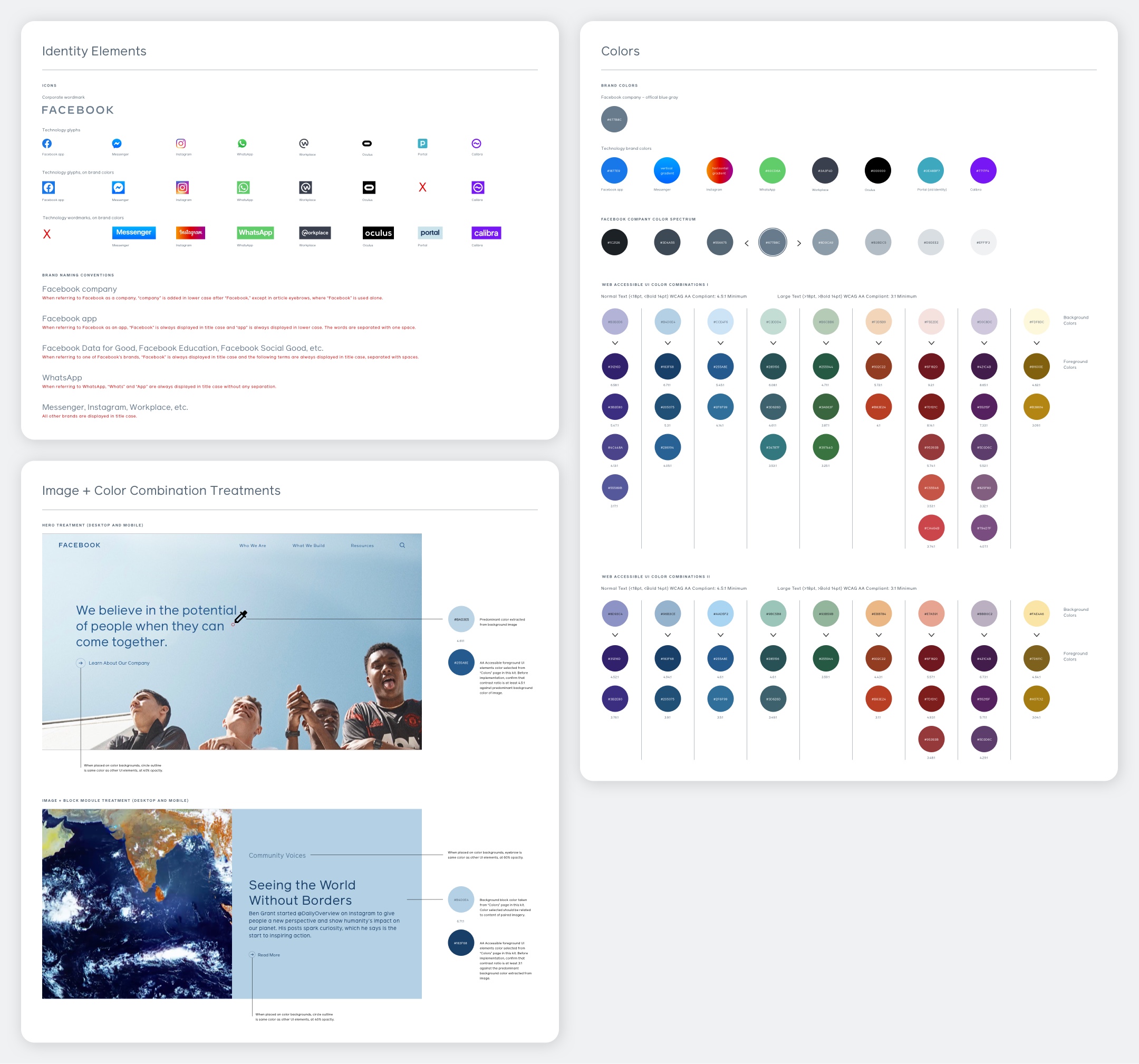
As the primary feature of the new identity, we've extensively developed our use of color and how it behaves on the platform through photography and typography. To express the new user-empathetic identity for the Facebook company through visuals in an easy-to-understand systematic manner, the brand's digital color selection system allows for content managers to enhance the connection between copy and image, metaphorically elevating our valuation of the visual content created by users.
Content managers select a color contained within a chosen image within the CMS, and then a contrasting color for typography placed atop said imagery. To assist this process, we've developed a swatch-based design system featuring predetermined AA compliant image-based hex color code combinations to act as a visual template.

Deployment
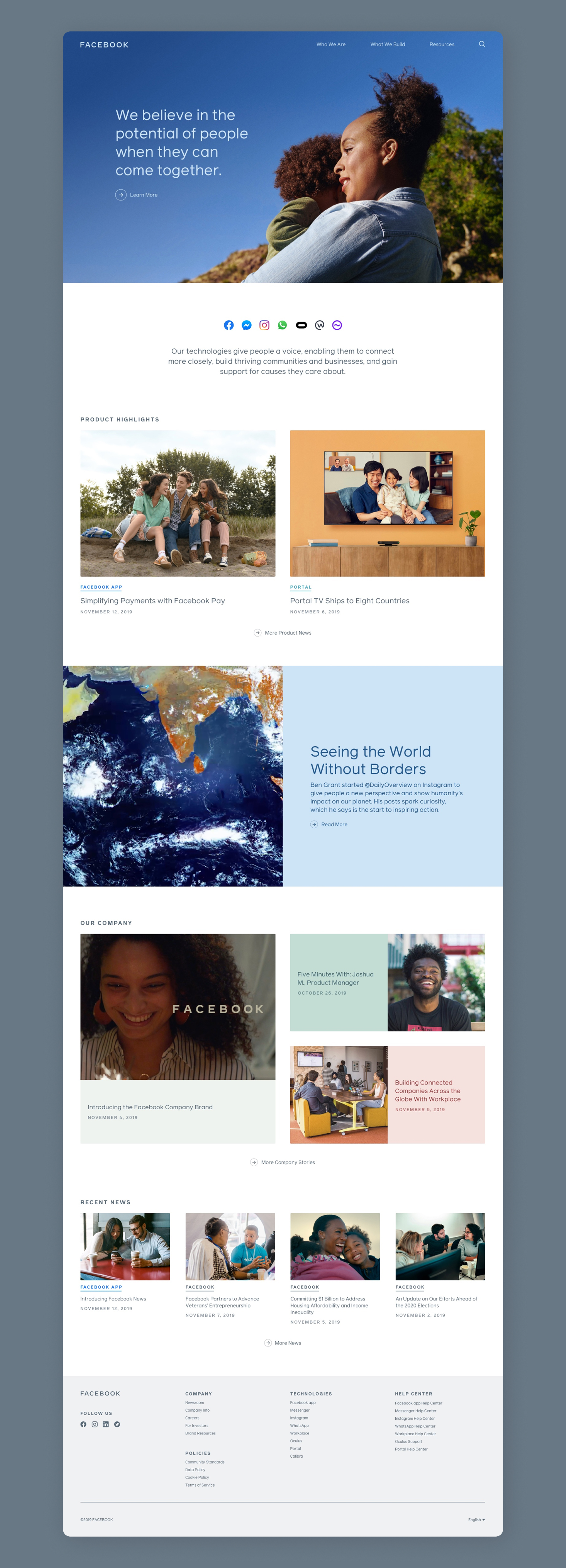
After we've created a digital brand expression and interface design system based on the new identity, here we expand on our initial color and design explorations to develop a fully functioning MVP for release. Through further refining of our taxonomies and content structures, we've landed on our launch product's interface.
The new corporate ethos, centered on the power of bringing people together, is the core point of emphasis in our strategic and artistic direction. With a new cinematic and photographic creative direction correlating with this human-focused ethos, here we finalize our pages aligning with this dramatic identity shift.

News
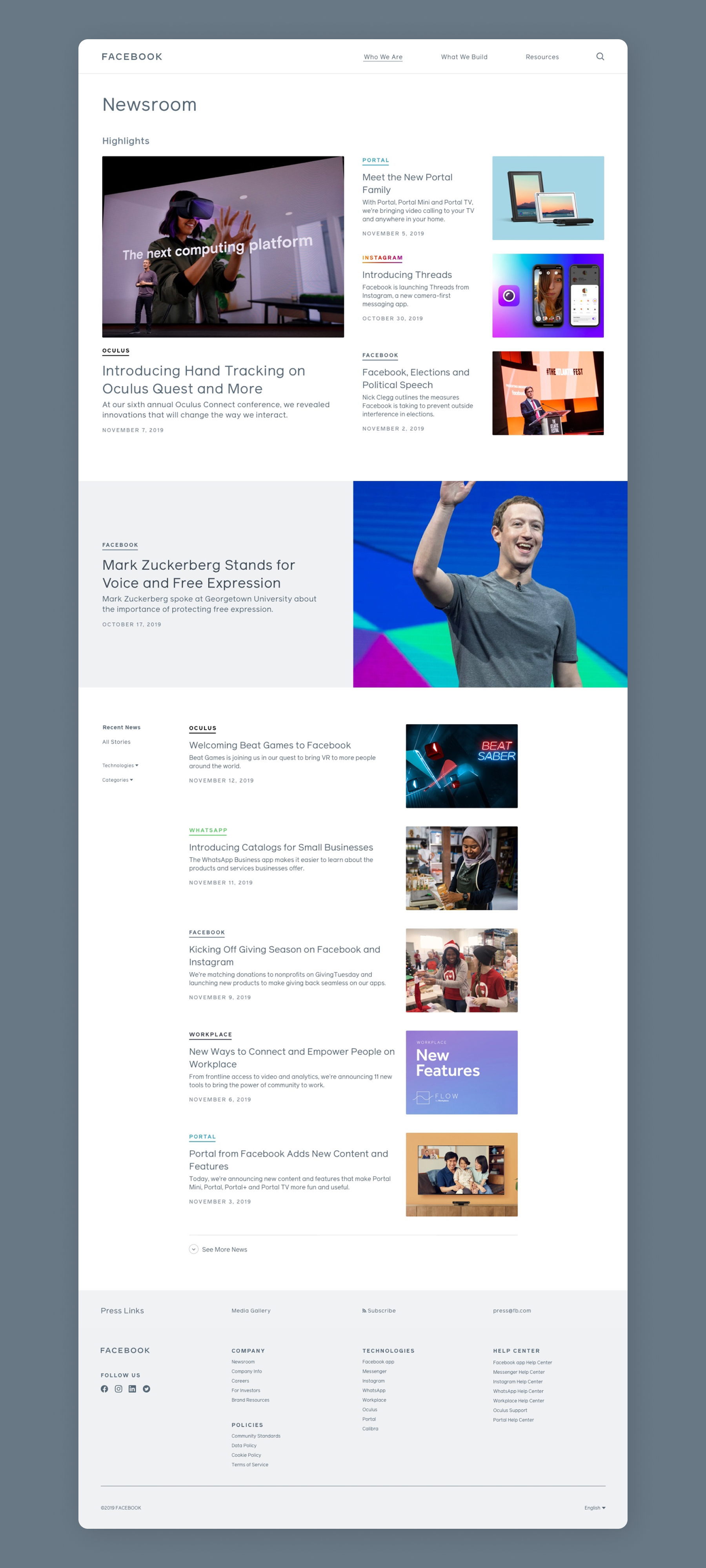
As important as providing a platform to enhance brand messaging is, ultimately the most common user intent of this site is to find news about Facebook company and all of its subsidiaries. To align with the newly redesigned landing and brand pages, here we create a completely new news and search section incorporating a completely new information structure and search interface.

Brands
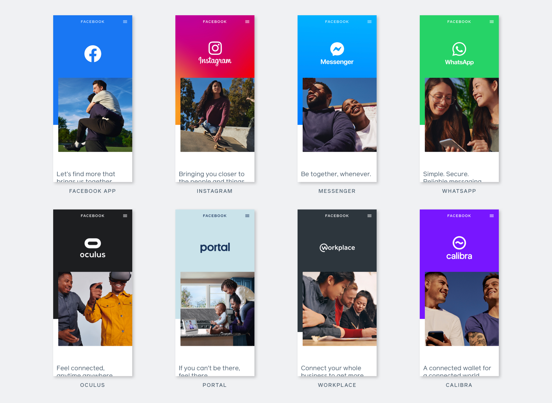
Besides the Facebook Company itself, this is a platform acting as a showcase of our individual sub-brands and technologies, which all have their own uniquely designed brand identities. Here we work to develop an easily expandable system inspired by the initial brand ethos behind the MVP in a quickly digestable, production-friendly manner. To allow these identities to maintain visual autonomy whilst also making clear that they are a part of Facebook company, we designed a templated visual architecture providing the sub-brands a canvas to display their uniqueness contained within the greater website's design system.

©2099